
Examples of animation for COVID-19*, H1N1 2009* and SARS 2003 are available.
COVID19 example input file* represents the confirmed cases of COVID19 up to April 19, 2020. Data was extracted from Johns Hopkins map.
H1N1 example input file* represents the confirmed cases of H1N1 according to WHO and processed by Lyn (Link).
SARS example input file represents the confirmed cases of SARS according to WHO (Link).
*To improve visualization (and with no epidemiological value), we generated random lat/lon coordinates within the country area for all countries that were represented by a single pair of lat/lon.
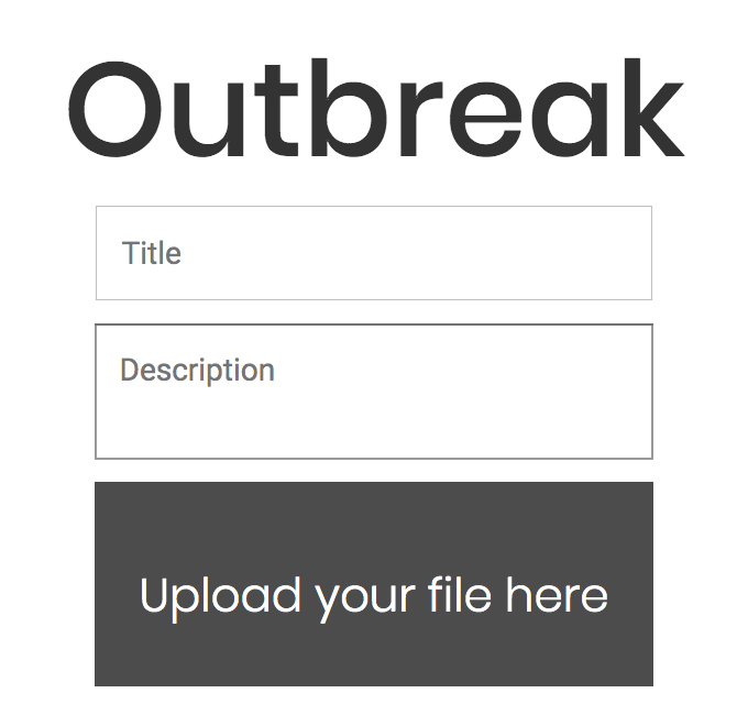
The user can write the title and a short description of the dataset to be visualized. This is going to be displayed in the animation. Check our paper here.
The input file containing the specific columns (see format below, and input file examples) can be dragged onto the “Upload your file here” option available on the homepage or can be uploaded manually.
Important privacy note:
Any data submitted to our servers are going to be deleted after a week.
Input file requires geographical (latitude and longitude pairs) and temporal (date) information. Users need to submit this information in a tab-delimited text file having at least following four columns (in bold are the specific column names):
The data is analyzed on our slberver and results are displayed on an interactive map. Users can zoom-in and zoom-out to monitor the geographical points. The earliest and latest dates are automatically identified. Users can also select preferred date-range using the calendar tool available on top-left of the page.
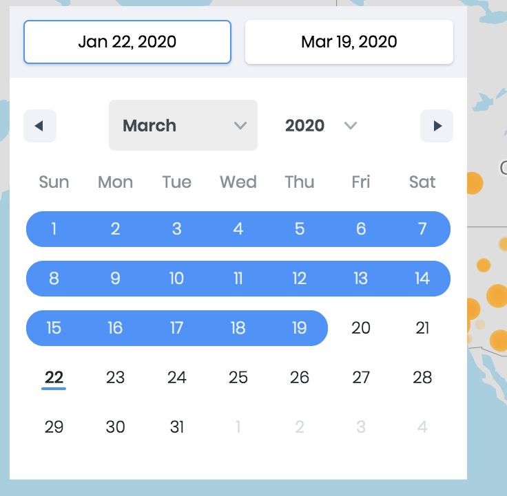
On the bottom-left, a play button is included to visualize the epidemic patterns throughout the outbreak period. Play board is accompanied by speed and reload options allowing users to generate their own outbreak animation. Moreover, social-share buttons are provided to share the animation webpage on Facebook, Twitter or copy link to Clipboard.

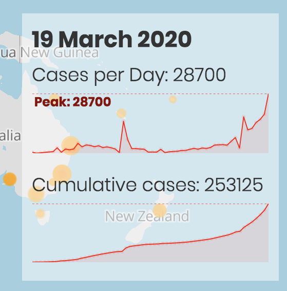
Finally, if the user provides the number of cases for each geographical coordinate pair, the number of cases and a cumulative number of cases for each day are displayed on the bottom-right in the form of peaks, numbers and text.
You need to install the Docker platform in your system, and run the following commands to install OUTBREAK image:
docker pull integrativebioinformatics/outbreak
docker run --rm -p 80:5000 integrativebioinformatics/outbreak
Then, you can open your browser and go to your localhost and load your data in your local server.